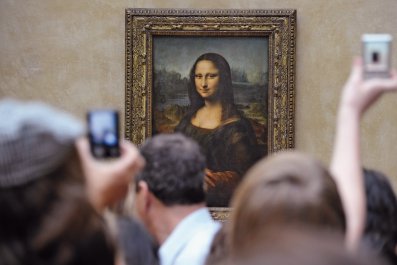
In Whit Stillman's daffy college-romance movie, Damsels in Distress, there's an undergrad who skipped pre-K and never learned his colors. The movie milks that gap in this dope's knowledge for all its worth, since who, after all, wouldn't feel a little superior to such an ignoramus?
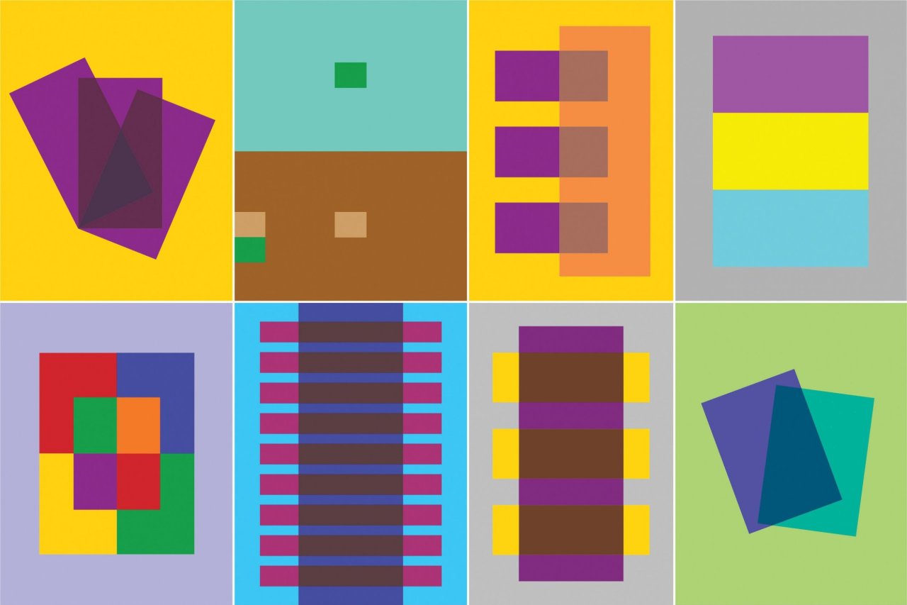
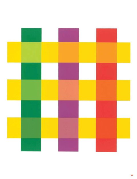
Josef Albers would have said the joke's on us. He once wrote a book to prove it. Interaction of Color, the Bauhaus-trained artist and teacher's instructional masterpiece, argues that all color is relative, that is, that we never see a color isolated but always in relation to other colors. Or, as Albers put it, "He who claims to see colors independent of their illusionary changes fools only himself, and no one else." Then, through a series of lectures girded with suitable-for-framing illustrations and brainteaser exercises, he quickly erases every iota of smugness concerning what you thought you knew about light intensity and brightness, transparency, or color temperature. It's a rough course, but it's never dull (any man who can spend a page making you think hard about the way we perceive the red in the Coca-Cola sign is someone to reckon with).
Since it was first published in 1963, the book has become a bible in the libraries of artists, designers, architects—any professional who works with color. Or at least anyone who can afford it: Albers's original was a two-volume, slip-cased edition that today retails for $250. Cheaper paperback editions do exist, but even the best is like a copy of a copy of a copy (the 1963 edition showed the color studies on unbound pages, and subsequent editions still use "tipped-in" papers, inserted after the book is bound, with colored flaps that can be pulled back to unmask the mutability of the relationships). Bring this book into your house and immediately everything around it looks a little shabby.
Now, timed to the book's 50th anniversary, there's an iPad app, with a much more real-life price of $9.99. It was only a matter of time before someone thought to upload Interaction of Color to the digital age. What is surprising is how good it is. And—DNA still intact—how humbling. I spent the better part of a week fooling around with it, and after reading Albers's text (penetrating, dryly funny, occasionally opaque) and working through some of his exercises, I'm down there with that doofus in the Stillman movie, only maybe more delusional since I did think I knew my colors.
Set beside the original, the app can't help but fall short. The tactile pleasure of the paper and the sublime, almost edible look of colored inks saturating that paper are missing from the app, which is, first and last, a thing under glass. But if you think of a book, or an app for that matter, as a tool, a means of conveying information, then things begin to equal out.
The tool analogy is particularly apt in Albers's case. By no means unsophisticated, he was nonetheless always as much a craftsman as he was a fine artist, although he would probably have erased the distinction. One of his grandfathers was a blacksmith, the other a carpenter. His father was also a carpenter, and a painter who worked in stained glass, the original métier of the son when he taught at the Bauhaus. So he would surely have acknowledged that some tools are better suited for certain jobs than for others, and that there are things that even one of the most beautiful books in the world cannot accomplish—things this app seems born to do.
The iPad version of Interaction of Color wisely retains Albers's page layouts, with their abrupt, visually striking line breaks, and his choice of an eminently readable Baskerville typeface (a Bauhaus artist who disliked sans serif type—who knew?). Supplemental material includes videos with talking heads—art historians, working artists, and designers—explaining Albers's techniques or showing how they use his ideas about color in their work. More valuably, the app also supplies blank templates and a color wheel from which you can work through Albers's exercises. I think he would have loved this innovation, because he designed his book like an instruction manual meant to teach the "development of observation and articulation." And the means to that end, he preached, was practice.
"The book ... does not follow an academic conception of 'theory and practice,'" he wrote. "It reverses this order and places practice before theory, which, after all, is the conclusion of practice." He didn't want his students to merely implement his ideas, but, through trial and error, to come up with their own. "I have not taught painting because it cannot be taught," Albers said. "I have taught seeing." And where the hardcover edition segregates text and images into separate volumes, the app puts them side by side, so you can toggle back and forth or click on a pull-down tab to bring the appropriate text right beside an image.
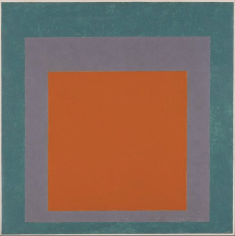
A man of parts (designer, typographer, poet, abstract artist), Albers is best known for his series Homages to the Square, paintings in which variously sized and colored squares are nested in multiples of three or four. Severe studies executed with an exactness worthy of a laboratory experiment (the artist punctiliously noted the colors and the manufacturers of those colors on the back of many of the paintings), these works are the ultimate abstracts, but without a whiff of romantic self-expression. Yet there is nothing chilly about them. On the contrary, the closer and longer you look, the more mesmerizing they become. If art is stuff that's profoundly fun to look at, this is as good as it gets.
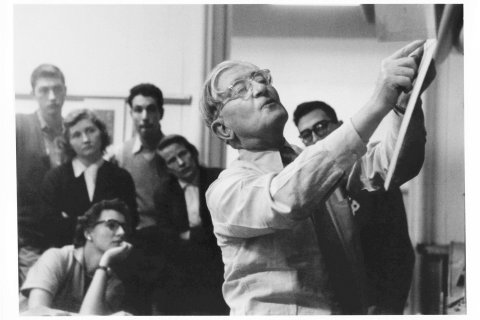
Albers began creating his Homages in 1950 and continued producing them until his death in 1976. He published Interaction of Color at that project's midpoint, like a master mechanic throwing open his tool chest. But the big reveal was Albers's other identity as a born—and lifelong—teacher. The dedication reads, "This book is my thanks to my students" at Black Mountain College and Yale. It ends with a list crediting individual students for specific contributions to the exercises (it's quite a list, too, including such names as Eva Hesse, Rackstraw Downes, Ruth Asawa, Janet Fish, Jay Maisel, and the poet Mark Strand). But roll-calling contributors is not just a nice gesture. It's Albers's way of reiterating the collaborative nature of the enterprise: he would always insist that he learned right along with his students.
This cannot be said too plainly: Interaction of Color is not solely for artists, though generations of them certainly owe Albers a debt. It is for anyone who wants to get under the hood and understand why and how we see the world the way we do. Be it book or be it app, this is a visionary work.